This project focuses on exploring typography and watch face layout relationships. Using an Apple Watch as the model for the layout, a series of five watch face designs were created in various formats from digital, analog, to a combination of the two. This series of designs showcases the various creative layouts that a digital watch can display.
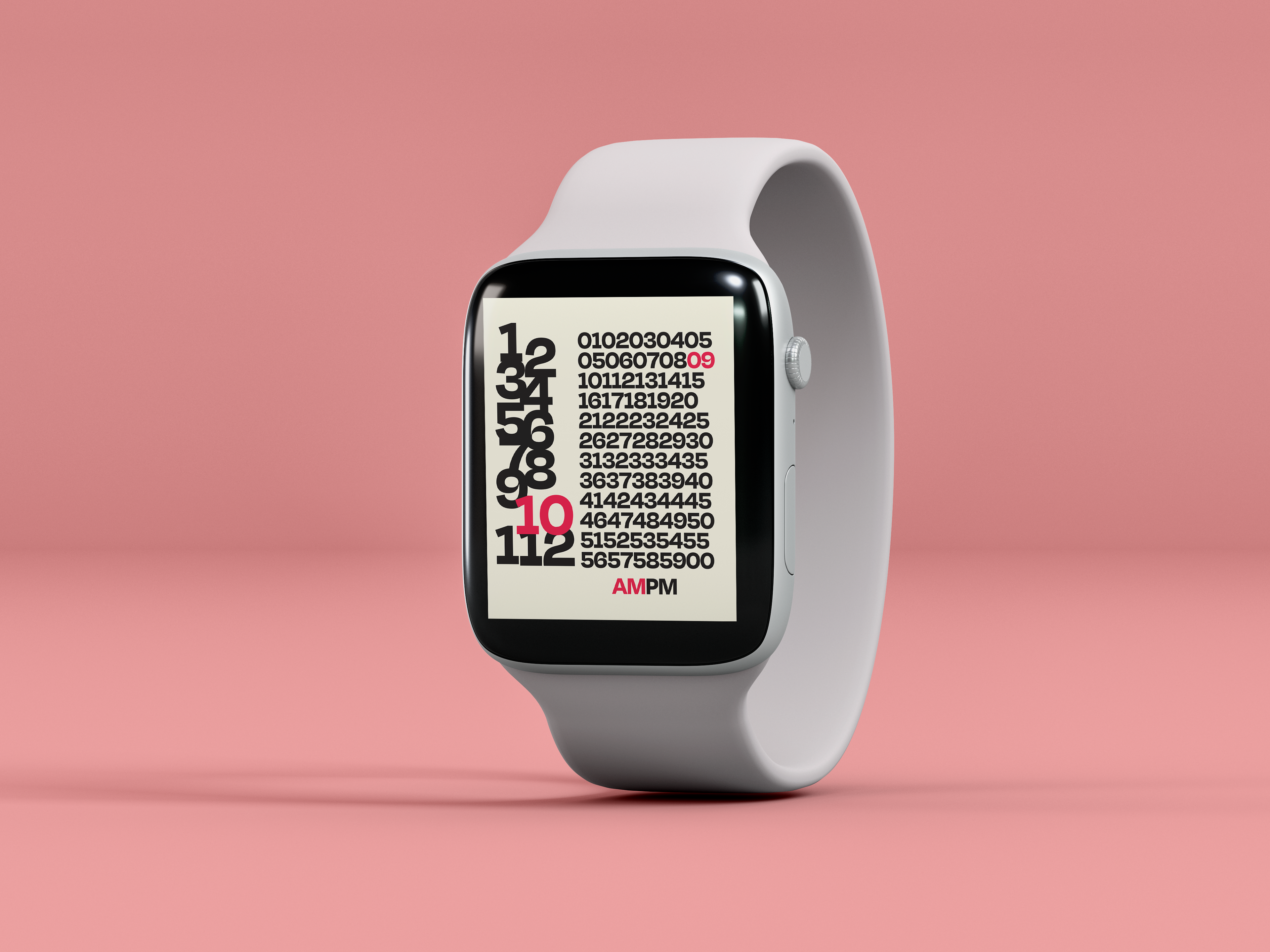
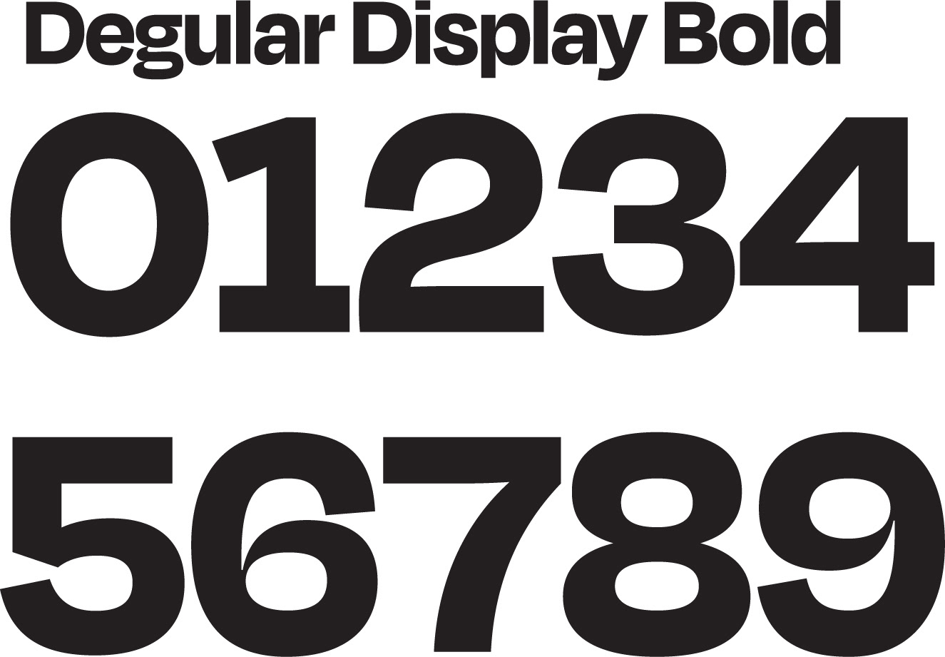
The typeface Degular Display Bold formats the clock in a way that showcases all hours and minutes at once on the entire screen, but only highlights what the current time is.
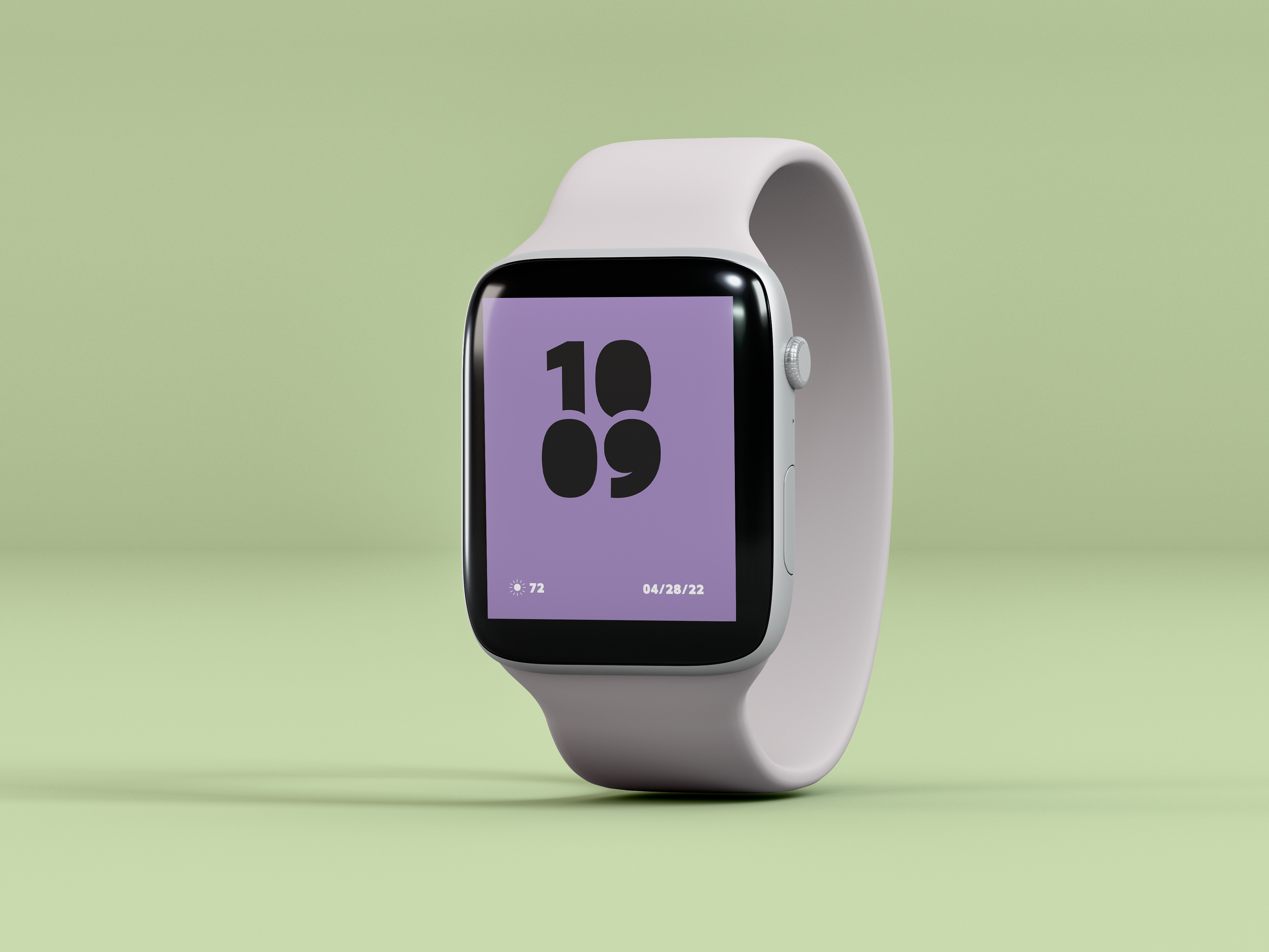
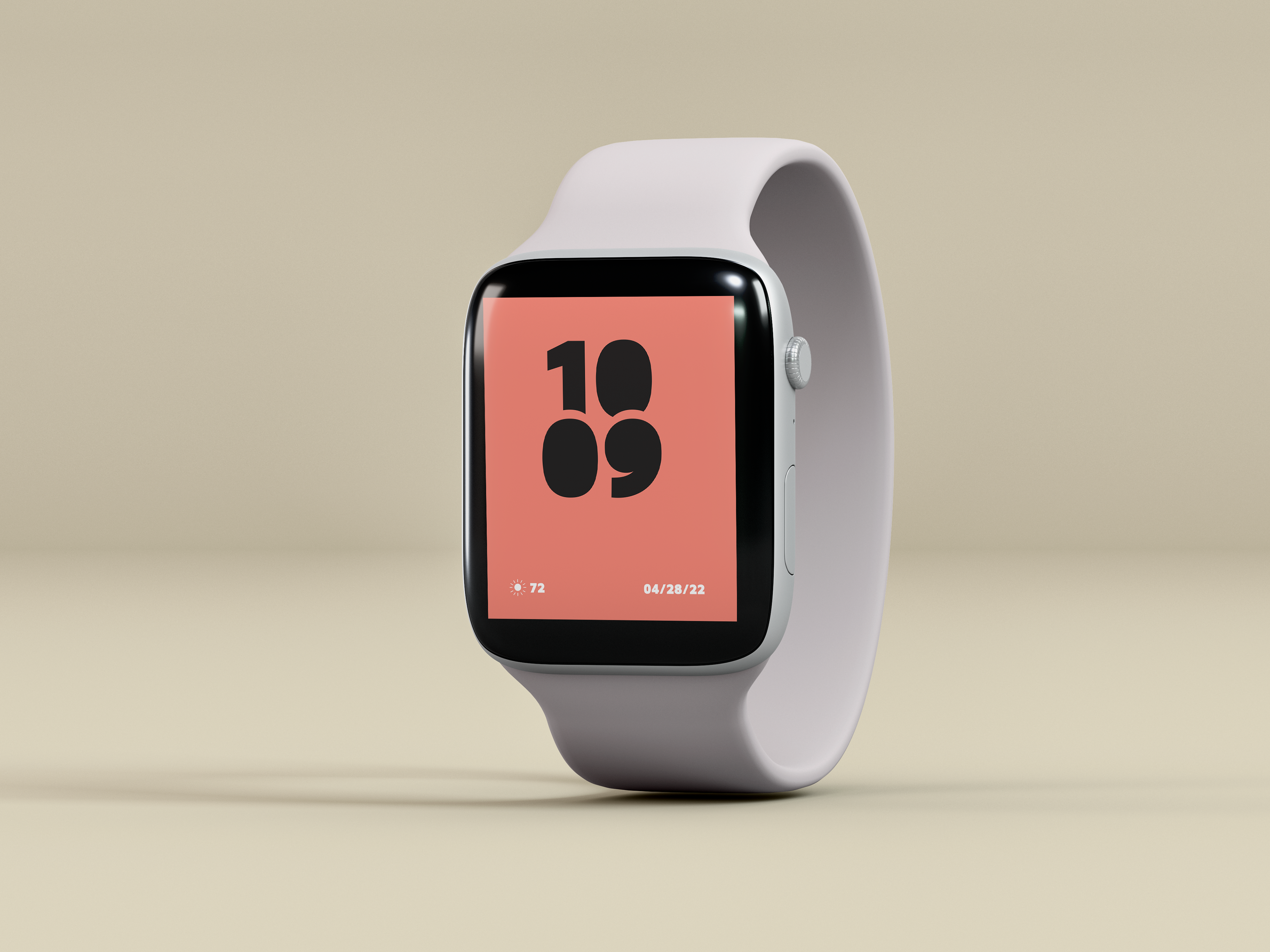
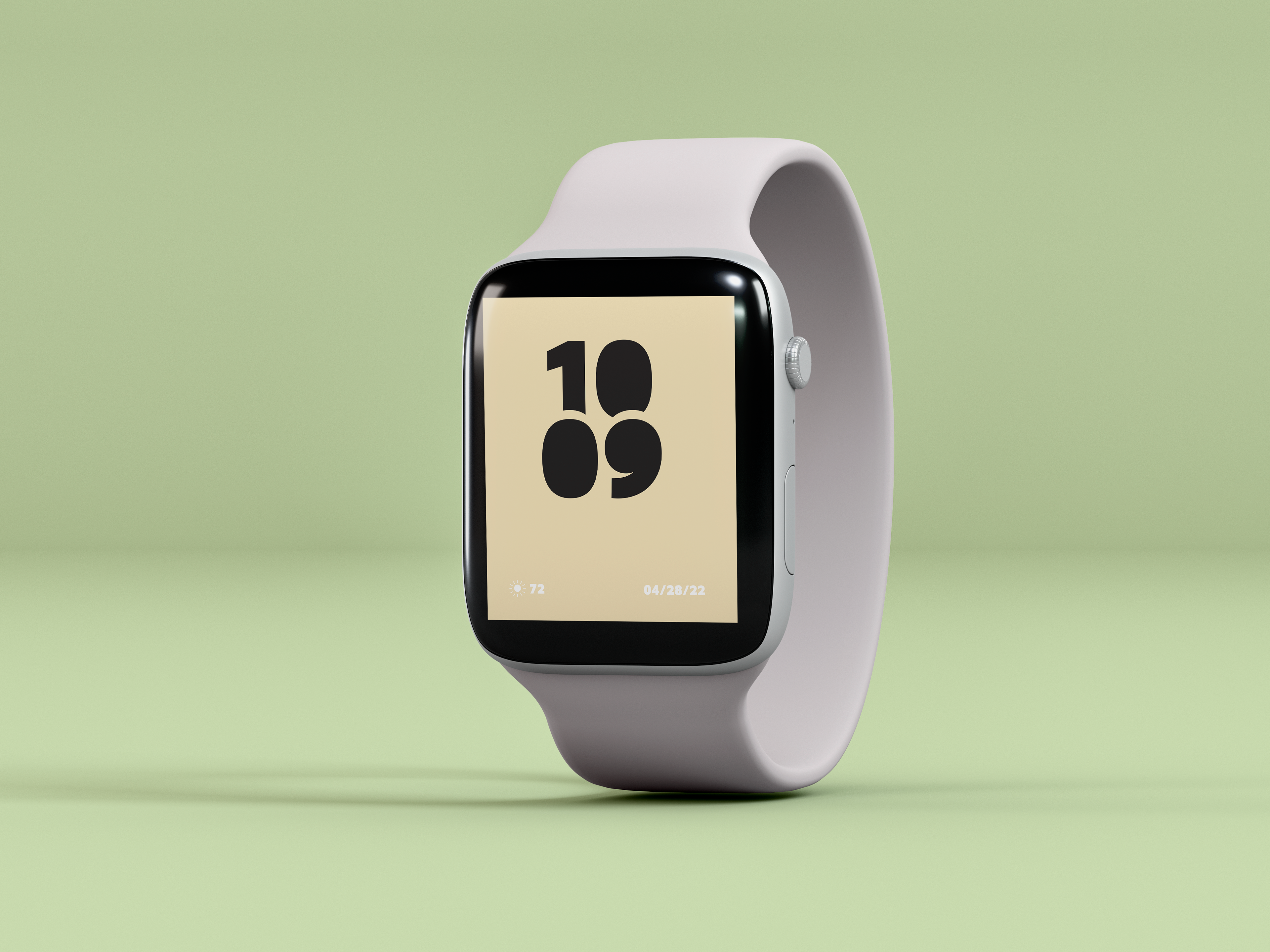
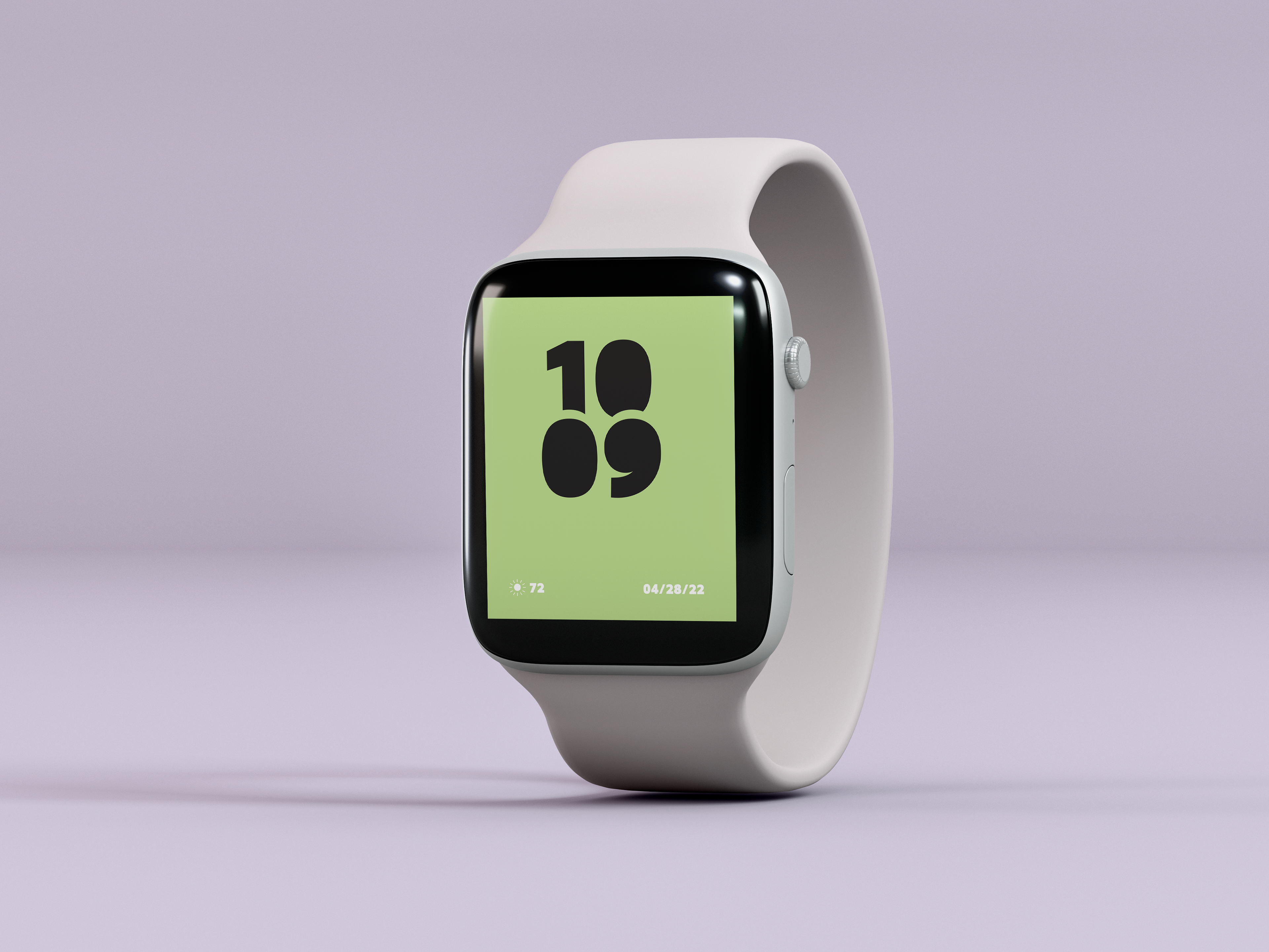
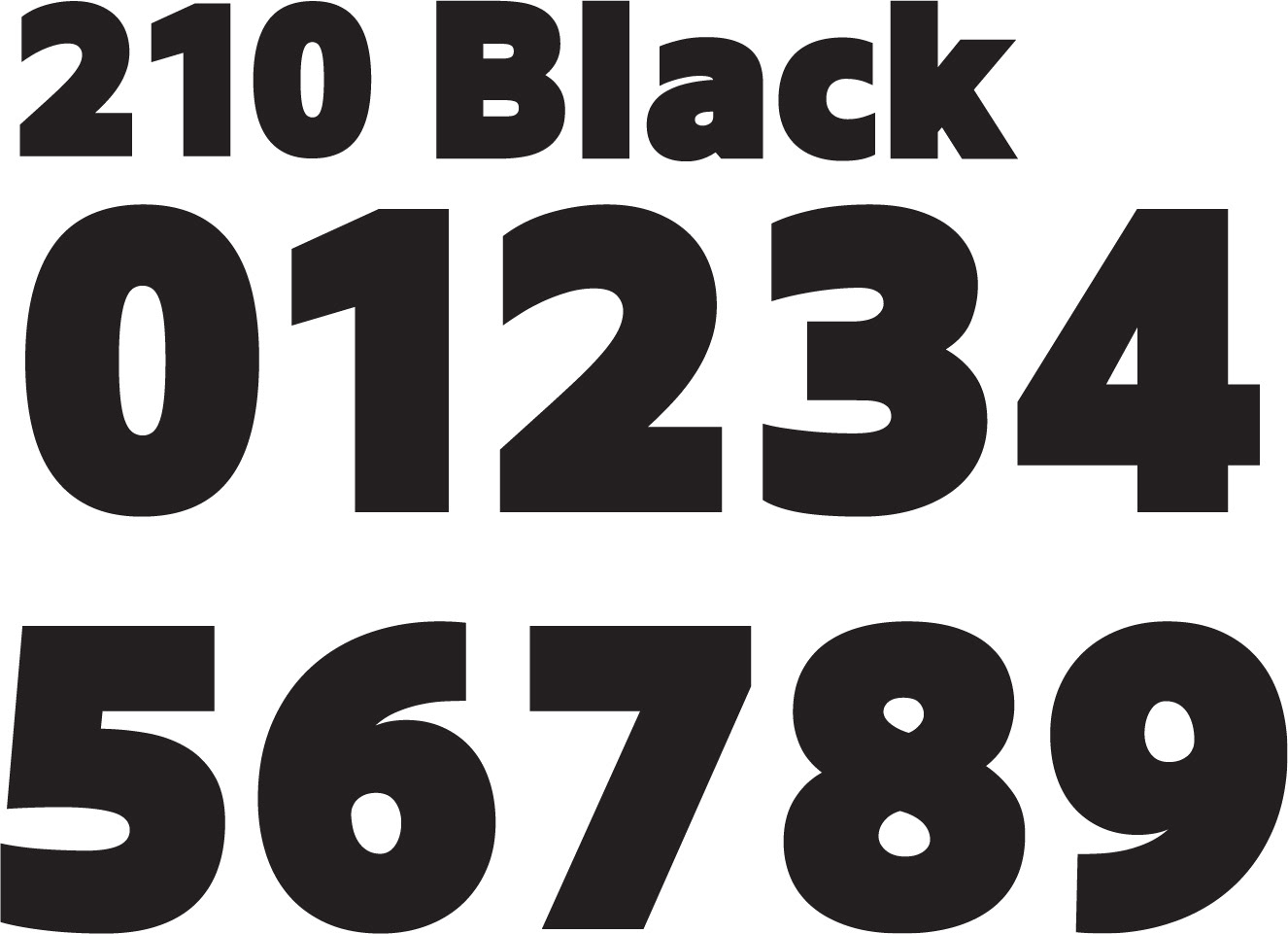
The second typeface 210 Black can be chosen between various colors, and displays the time in a bold yet readable layout.
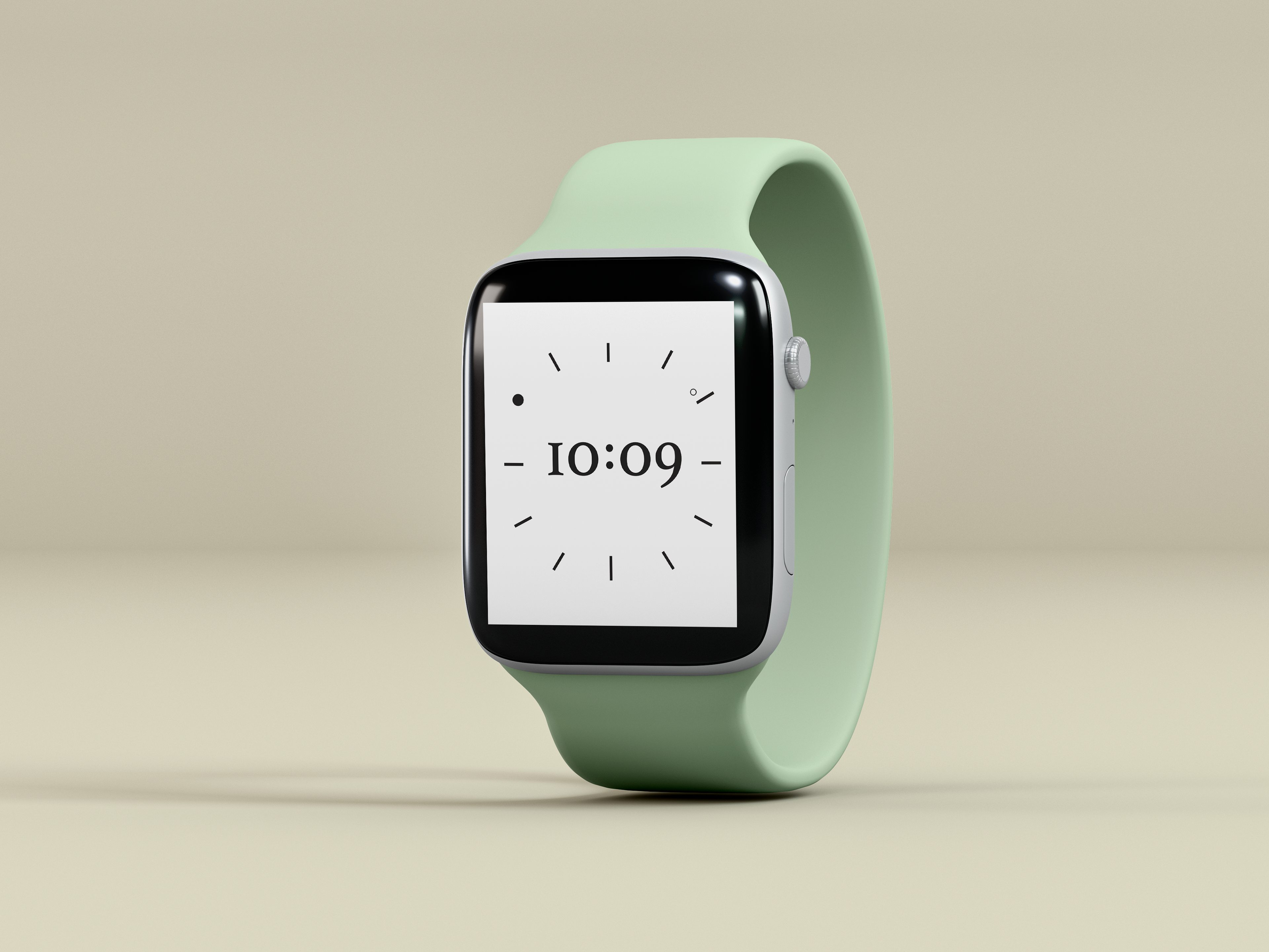
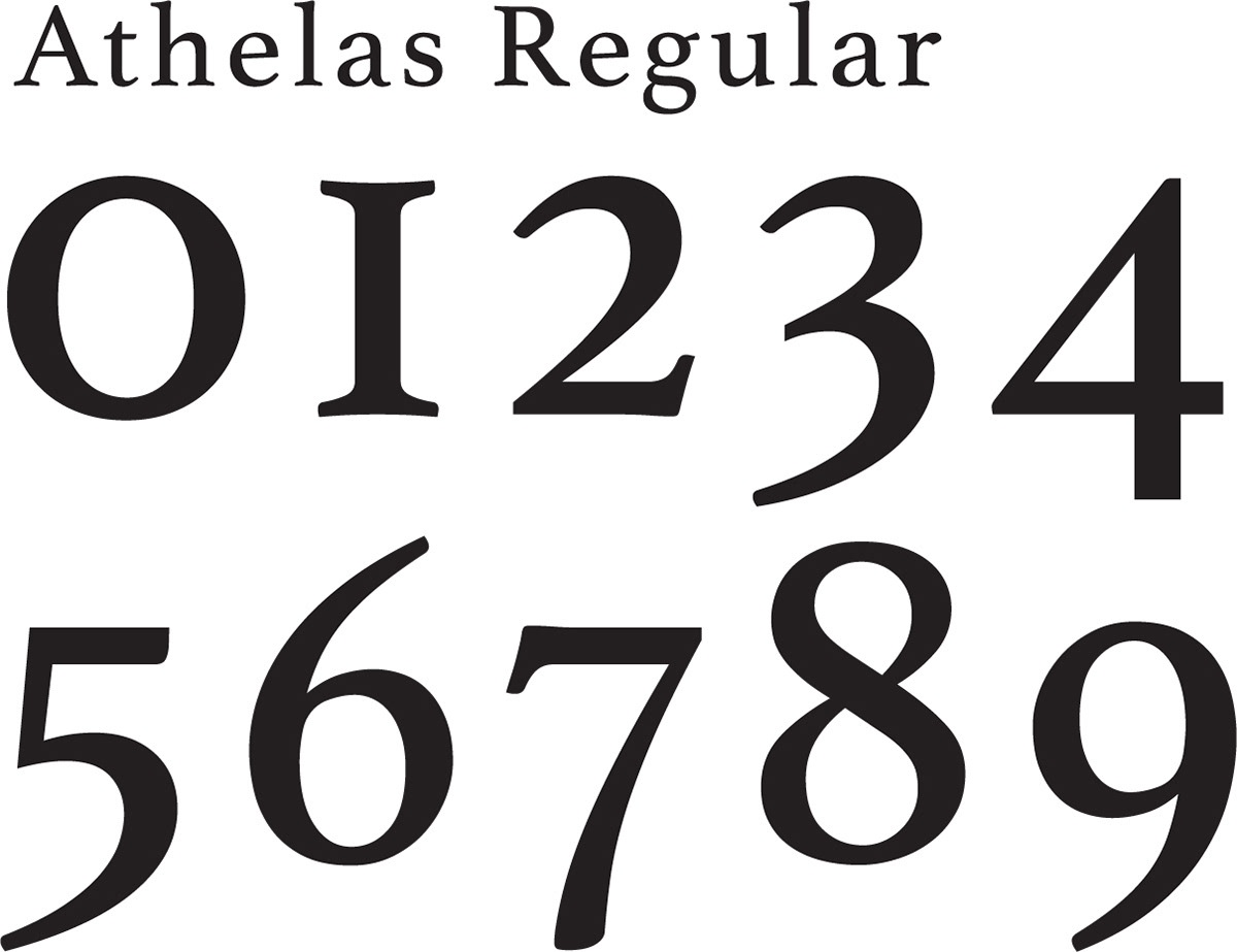
Two traditonal watch face designs were also created as a part of this series. The Roman numeral typeface Athelas Regular is combined with an analog clock design, with a solid and outlined circle to represent the minute and hour hands
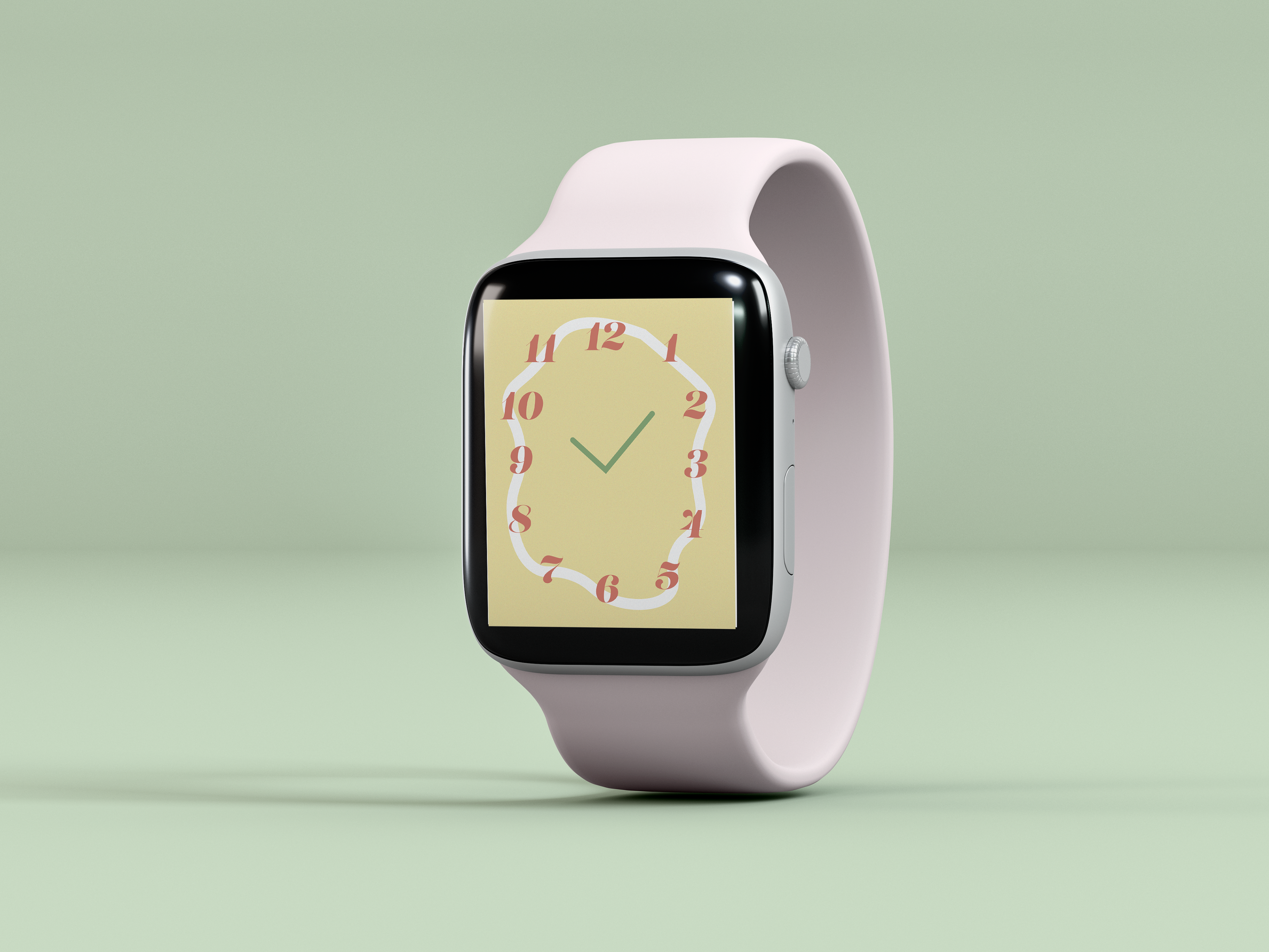

The second analog watch face in Lust Italic is paired with an overlapping funky oval background, and traditional straight hour and minute hands.
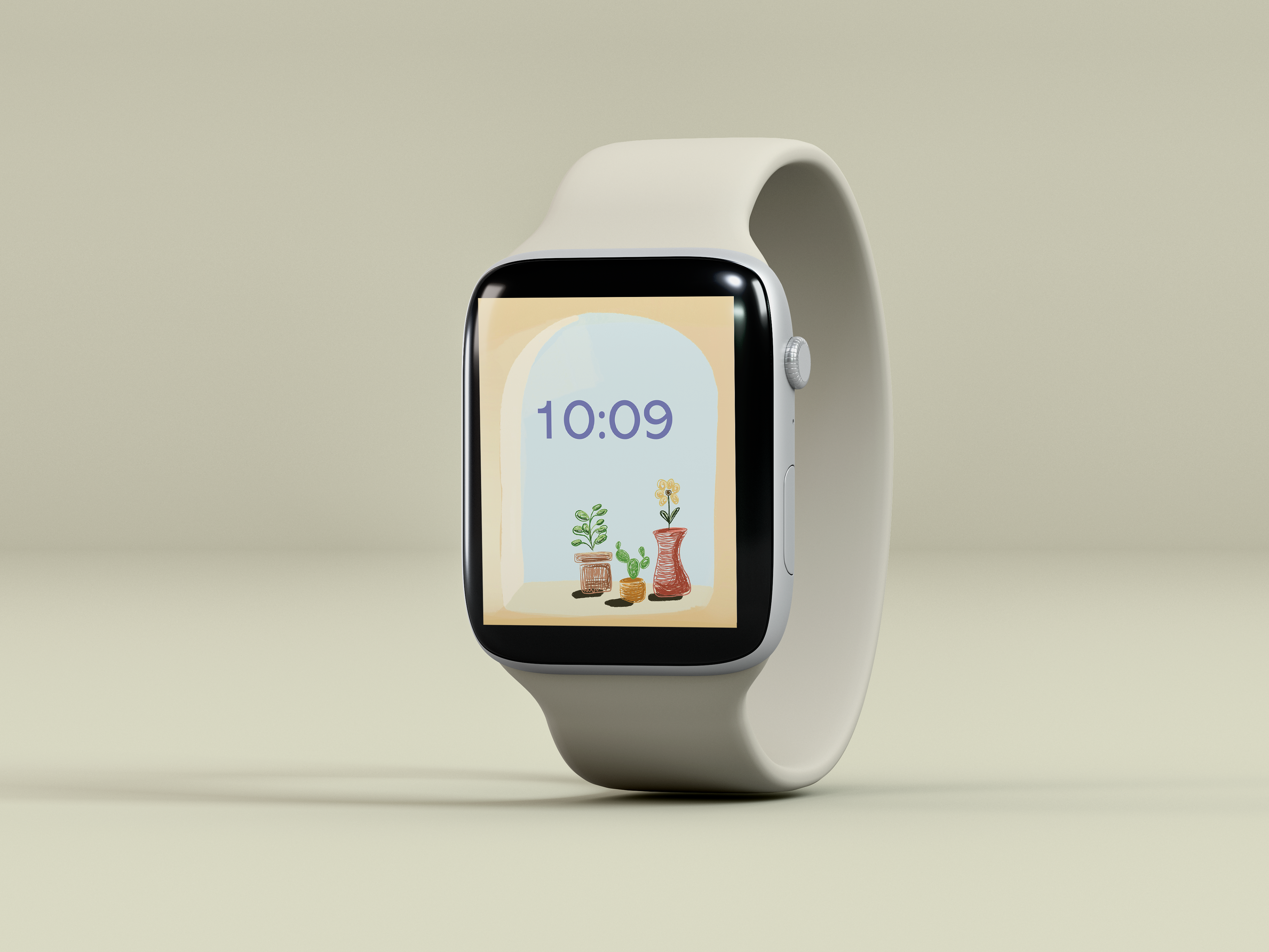
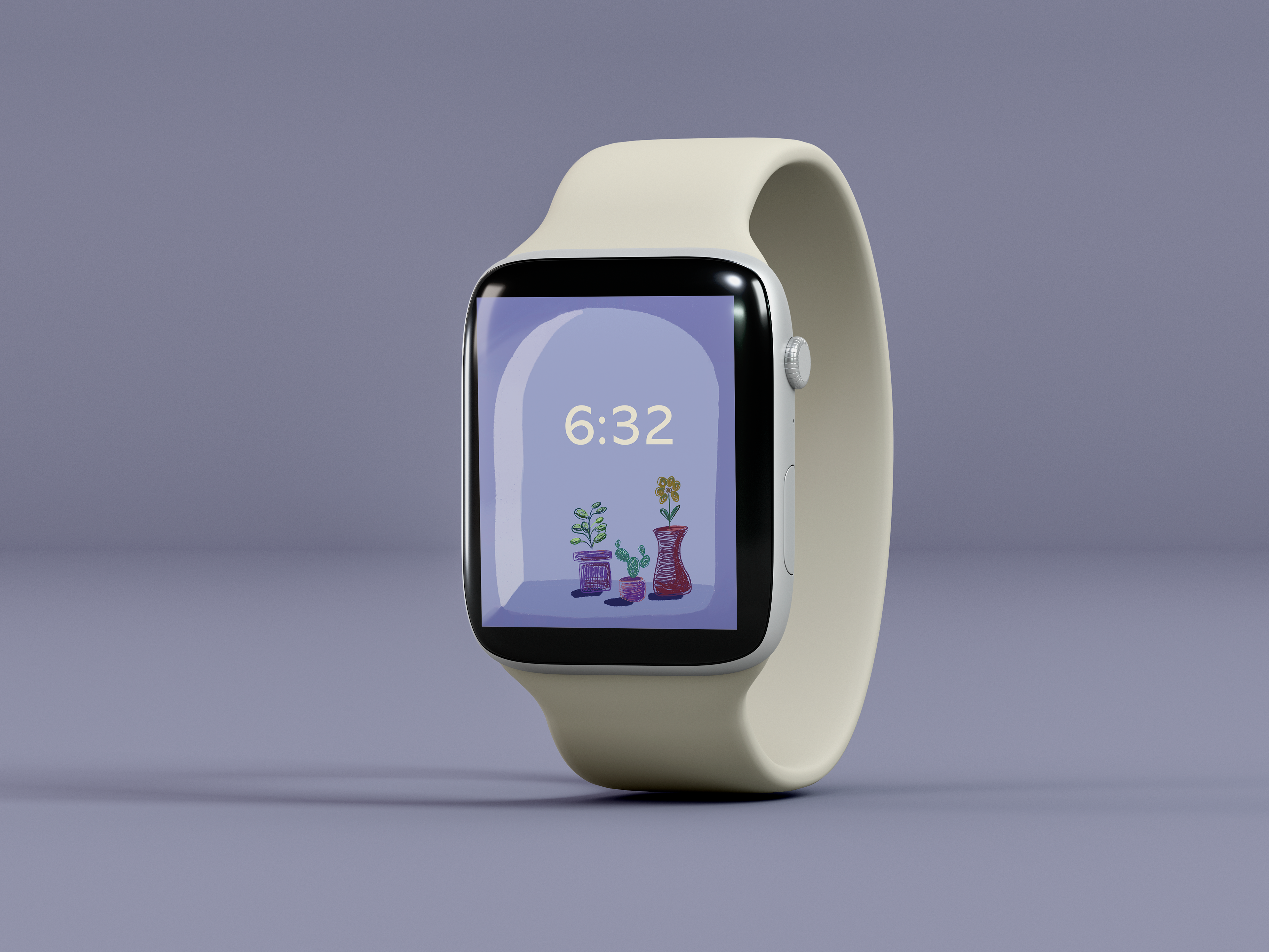

The Apple Watches have a special capability to provide “dynamic screens,” where the user can choose from a variety of pictures that will visually change throughout the day, and follow the accurate lighting of the wearer’s day. This design illustrates two different dynamic scenes, in which it is morning and evening. The windowsill illustration showcases the way the light can move and change throughout the day, giving users the dynamic screen-time experience. The typeface chosen for this design is Abadi MT Pro Regular.
